Redesign for a middle grade author
Abstract
The Purpose & the Problem - Mary Sloat is a middle grade and young adult author who currently uses her website to share her new ideas and past stories. She is not familiar with web development and built the site herself using a Wix template. Recently, she has noticed that the websites of her peers appear more professional. In an effort to boost her professional web presence, Mary contacted me with this freelance project to rebrand her website.
What I Found & What I Did - I completed this solo project over the course of one week. I validated her initial observation through competitive analysis and prototyped an alternative that would help the website stand out within the middle grade author market.
Medium
Desktop
Techniques
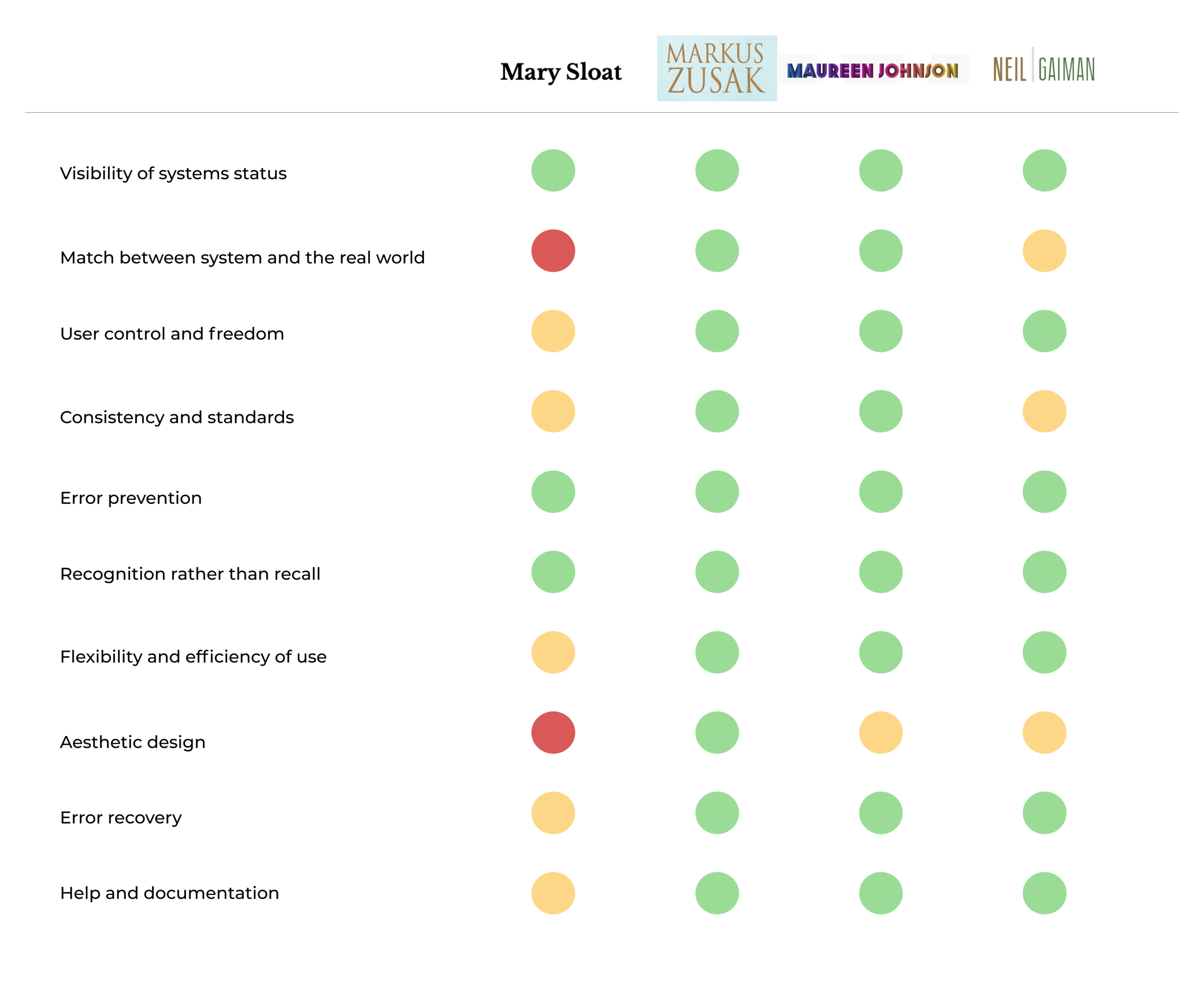
Heuristic Analysis
Information Architecture
Competitive Analysis
Wireframes
High-Fidelity Prototype
Tools
Sketch
Procreate
peer analysis
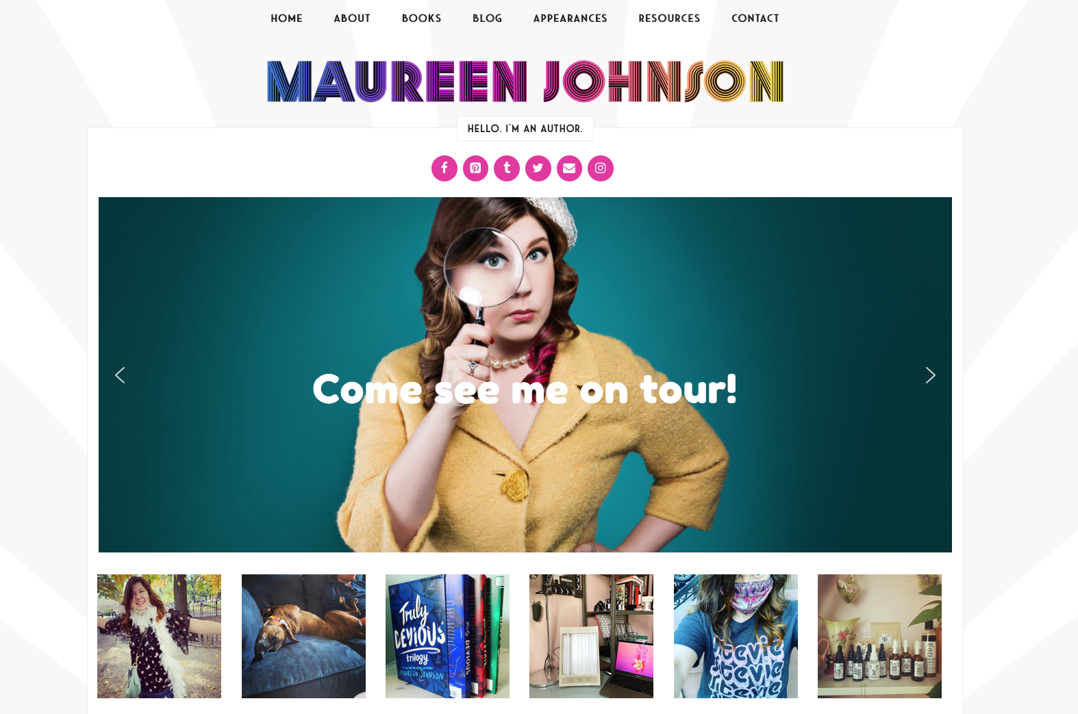
I started this challenge by conducting a competitive and heuristic analysis. Competitors’ websites, those of other middle-grade authors (Neil Gaiman, Maureen Johnson, and Markus Zusak) display:
cohesive branding
clear project and book references
intuitive navigation
These features should be included in order to present a website on par with the current standards. However, this research also indicated some areas where Mary’s website can excel: not all popular authors use the clearest language and some display clunky design.
Current Website
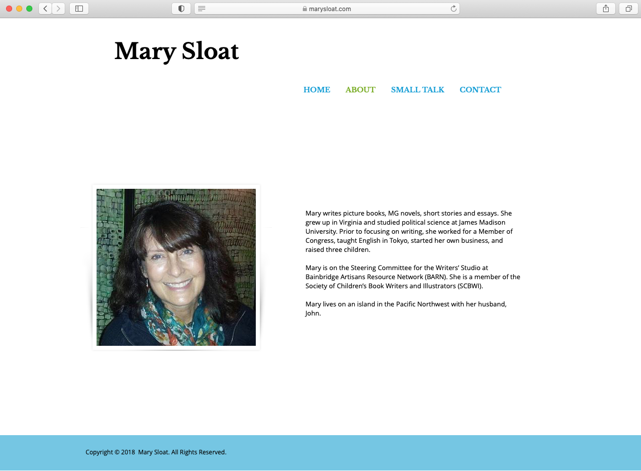
Mary’s website does not accurately inform the user of where they are navigating, lacks flexibility, and displays an out-of-date design.
My approach
Based on my competitive and heuristic analyses, I knew which areas needed the most attention. Given the scope of this project, I set out to improve two key features of the website:
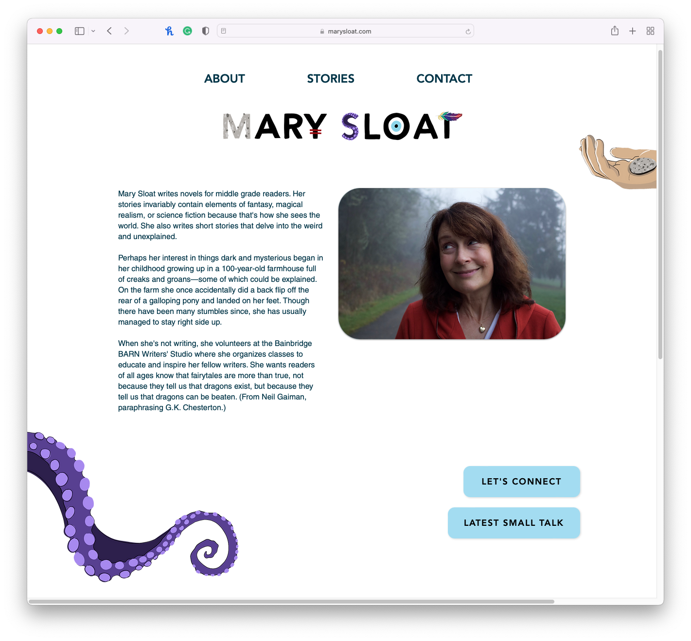
Navigation — Many authors use stylized language such as “Where’s Neil” or “Cool Stuff and Things.” I didn’t want to limit the author’s creative expression and so chose to consolidate features under similar headings while maintaining some of the creative-yet-clear labeling.
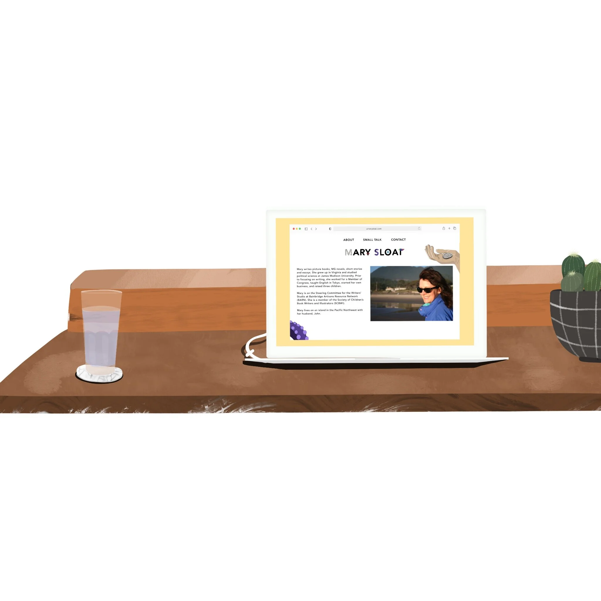
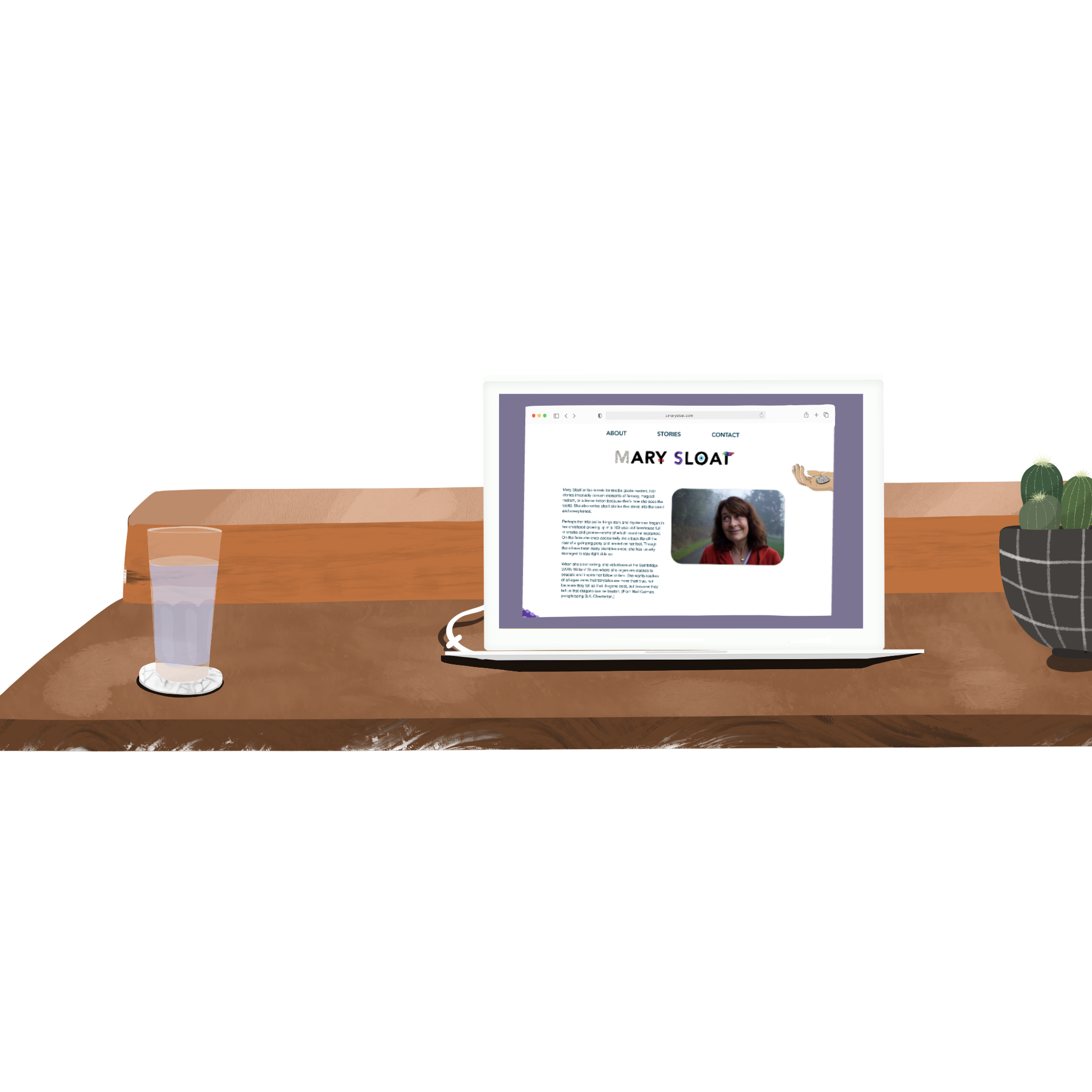
Design — I updated the main buttons to a more minimalist color palette. I chose to add color by incorporating unique illustrations drawn from her stories. I aimed to give the website a more modern and fun-loving approach that matches the current trends in middle grade author websites and also communicates Mary’s unique and creative style.
Looking forward
Given a larger project scope, I would —
Conduct usability testing to better understand users’ interactions with this website and authors’ websites in general. I would interview both potential readers and publishers to understand if this new version appropriately caters to both audiences.
Incorporate a web-traffic tracking feature to better understand how real users are interacting with the design.
Thanks for visiting!
Please feel free to contact me to learn more about my work.

