The Muse
Abstract
The Purpose & the Problem - Our client, Jordan Albano, identified a need for an inclusive, content-based app with a charitable focus benefiting the queer community. He wanted to create a unique and accepting space for artists of all kinds who want to be part of a community that makes monthly donations to a queer charity in need. He needed help validating his vision and developing an MVP prototype that he could use to pitch investors.
What We Found & What We Did - Our research indicated that the charity feature was unique and exciting to users and would allow this product to stand out. We developed a prototype from the perspective of a content creator. We demonstrated our envisioned user experience - onboarding, posting and viewing content, searching and subscribing, and managing content. I spearheaded the creation of a brand identity for The Muse.
The Team
Four UX Designers
My Contribution
Research, Wire-framing, Prototyping, and Graphic Design
Medium
Mobile
Techniques
Sketching
User Interviews
Persona
Competitive Analysis
Feature Prioritization
Medium-Fidelity Wireframes
Usability Testing
High-Fidelity Prototype
Tools
Miro
Figma
The Problem
While Jordan had taken the initial steps by conceptualizing and creating some initial wireframes, none of these deliverables were backed up by UX research. We needed to take his unique concept and use all the tools and techniques of the UX design process to validate and iterate his initial concept.
My team completed this task over the course of two and a half weeks and delivered an MVP high-fidelity prototype that Jordan could pass on to developers or use to pitch investors.
The competition
Analyzing the competition allowed us to identify what features we needed to include in order to meet user expectations as well as the areas where we could stand out in a saturated market.
Standards
Subscription and communication capabilities are similar across all of the platforms so users will likely expect to be able to subscribe to and interact with content creators.
Opportunities
Currently available platforms lack a charitable focus. While content creators can decide on their own to raise money for a specific cause, there is no app with a community-wide focus on charity.
The user
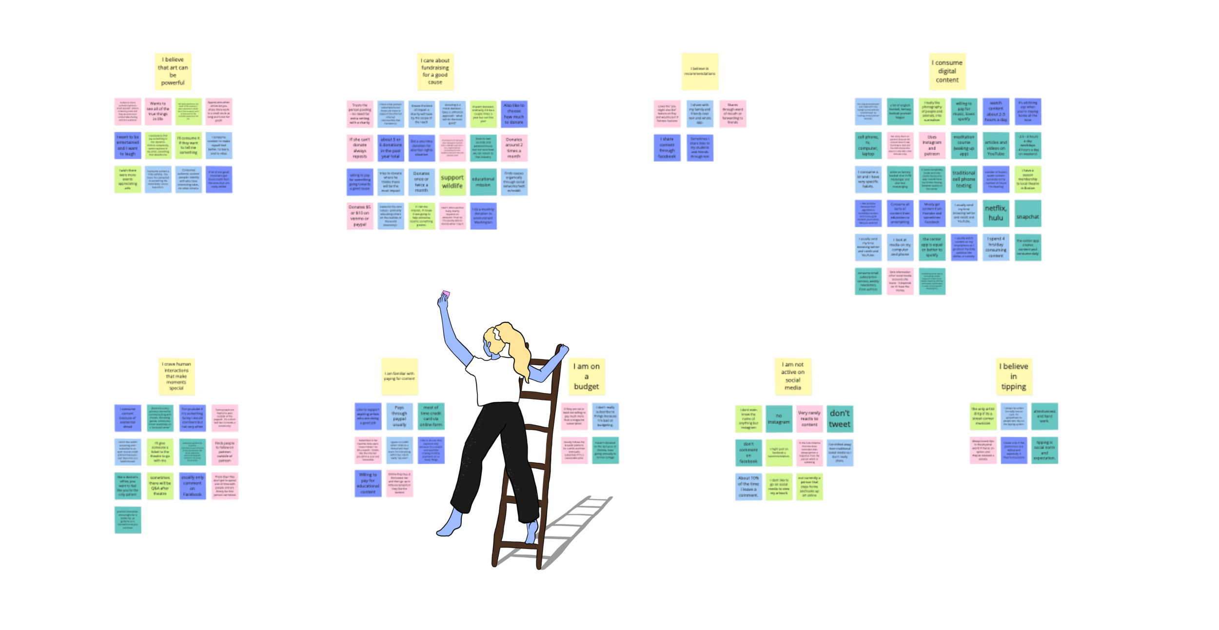
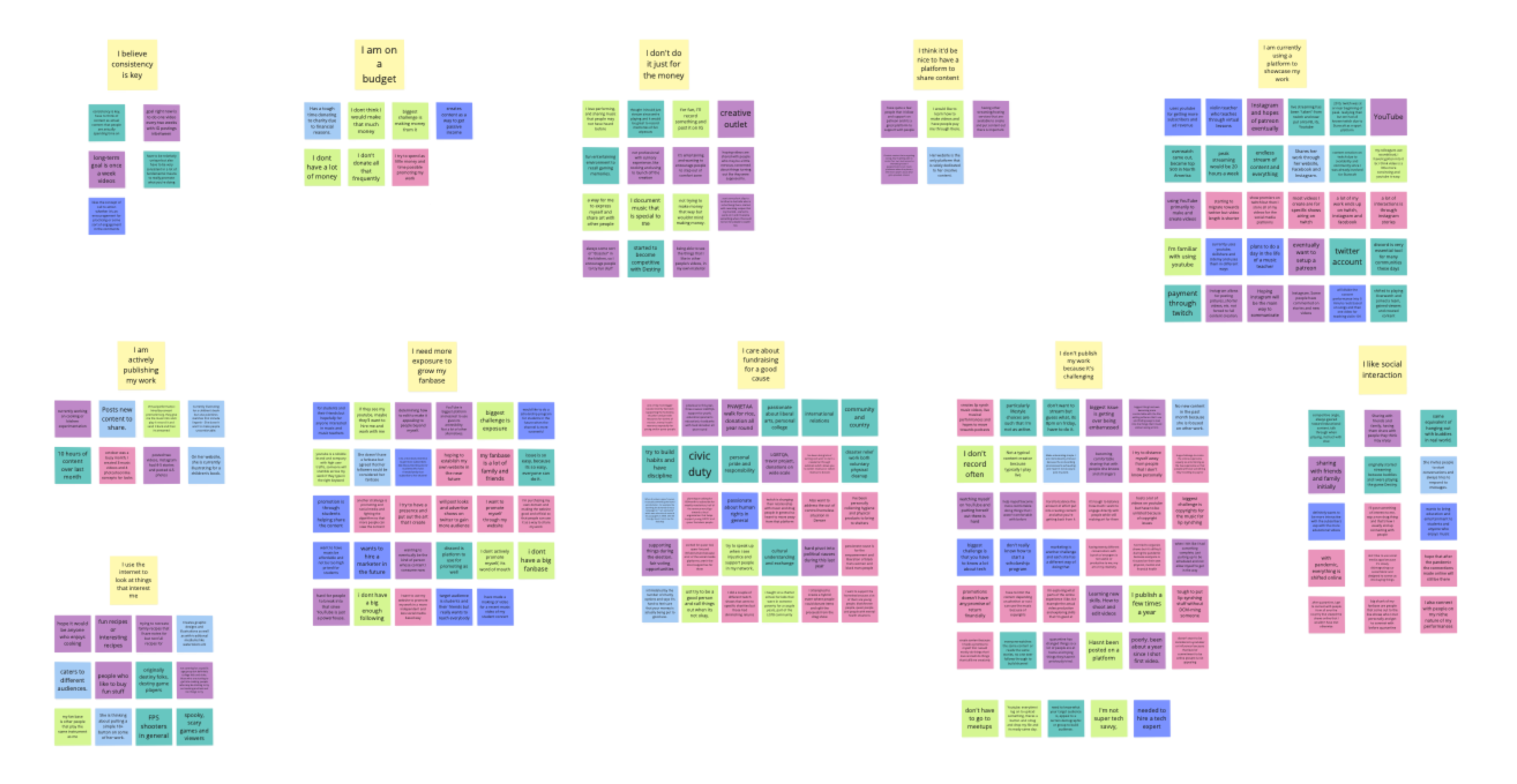
We interviewed six content creators and five consumers to identify current behaviors and pain points that they encounter while interacting with current content-based applications. We interviewed individuals aged 28-35 who created and consumed a wide variety of content: music, literature, art, drag and burlesque performances, gaming, and tutorials.
Content Creator Affinity Map
User Affinity Map
Key Insights
After compiling and sorting our interview notes into like categories, we sat down to discuss how to prioritize the plethora of insights we had gathered. Ultimately, we decided to focus on one potential user, the content creator, and one stand-out concept, charitable donations. We discussed our decision to home in on the content-creator user with our client and they agreed that this would be the most efficient and valuable use of our time.
In order to keep the content-creator user in mind throughout the design process, we created a persona based on the information we had gathered during the user interviews. The visual and written representation of our user helps us empathize with her and keeps the focus of our future designs user-centered.
User Persona
Key features
Opening Tutorial
Both users and content creators reported that ease of use was a large factor in determining if they would engage with a new platform.
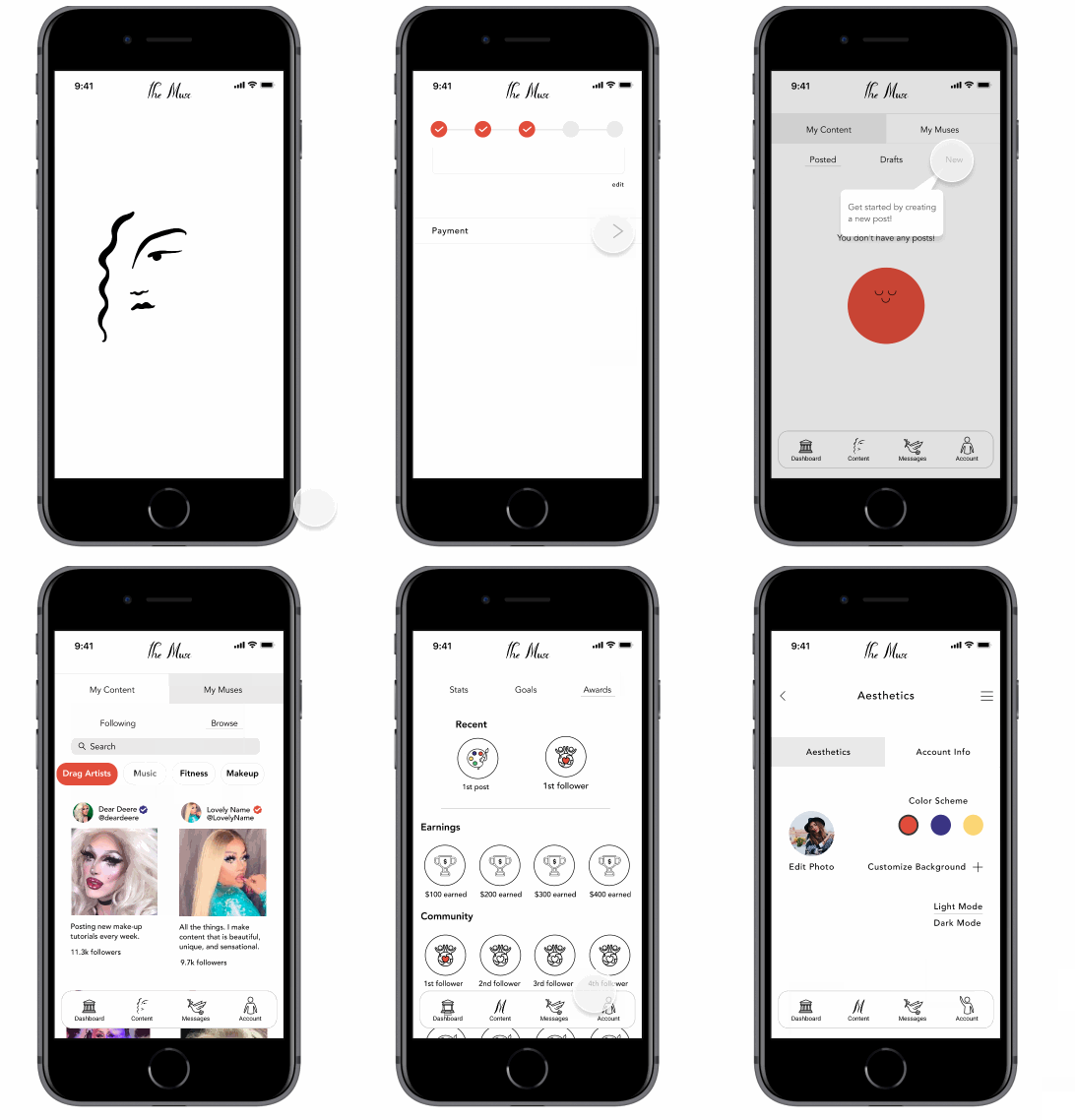
In order to streamline the onboarding process, we included an opening tutorial in addition to fun and encouraging images.
Posting Content
Content creators understood the importance of growing their following. However, they struggled with adhering to a schedule that would allow them to grow their fan bases.
To combat this barrier, we included a feature that would allow content creators to set goals (either privately or publicly) and included an awards feature to reward and encourage goal completion.
Charity Spotlight and Fundraising
We discovered that while the majority of our potential users care about supporting charities, they were more likely to donate when they felt a personal connection to the cause.
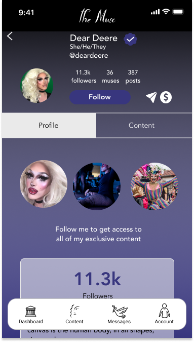
We decided to add an additional charitable component on top of the app’s monthly donations. Content creators are able to select a charity that is meaningful to them and highlight their choice on their profile.
Subscription & Category Search
Users want to be able to quickly find content creators and are looking for an intimate and unique experience.
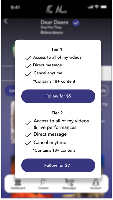
We included a feature that allows users to search by category or name. Additionally, by creating a small paywall through subscription tiers, we provided users with the exclusive experience they were craving.
Brand IDENTITY
Through conversations with our client, we discovered that he was open and excited about pivoting the brand identity based upon the user research. In order to facilitate a re-branding, we wanted to highlight some of the emotional insights we gained about the creative process. We found that a big theme among users and creators alike was creativity and inspiration. Using these key words we brainstormed ideas and eventually landed on “The Muse.”
We followed up with another round of user interviews to gain some additional aesthetic insight and the responses were scattered across the color wheel. Ultimately, we felt that “The Muse” encompassed an incredibly broad set of creative styles and that we should allow users to apply their own aesthetic to their platform. We decided to keep the main navigation simple, like a blank canvas, and allow for individual color customization.
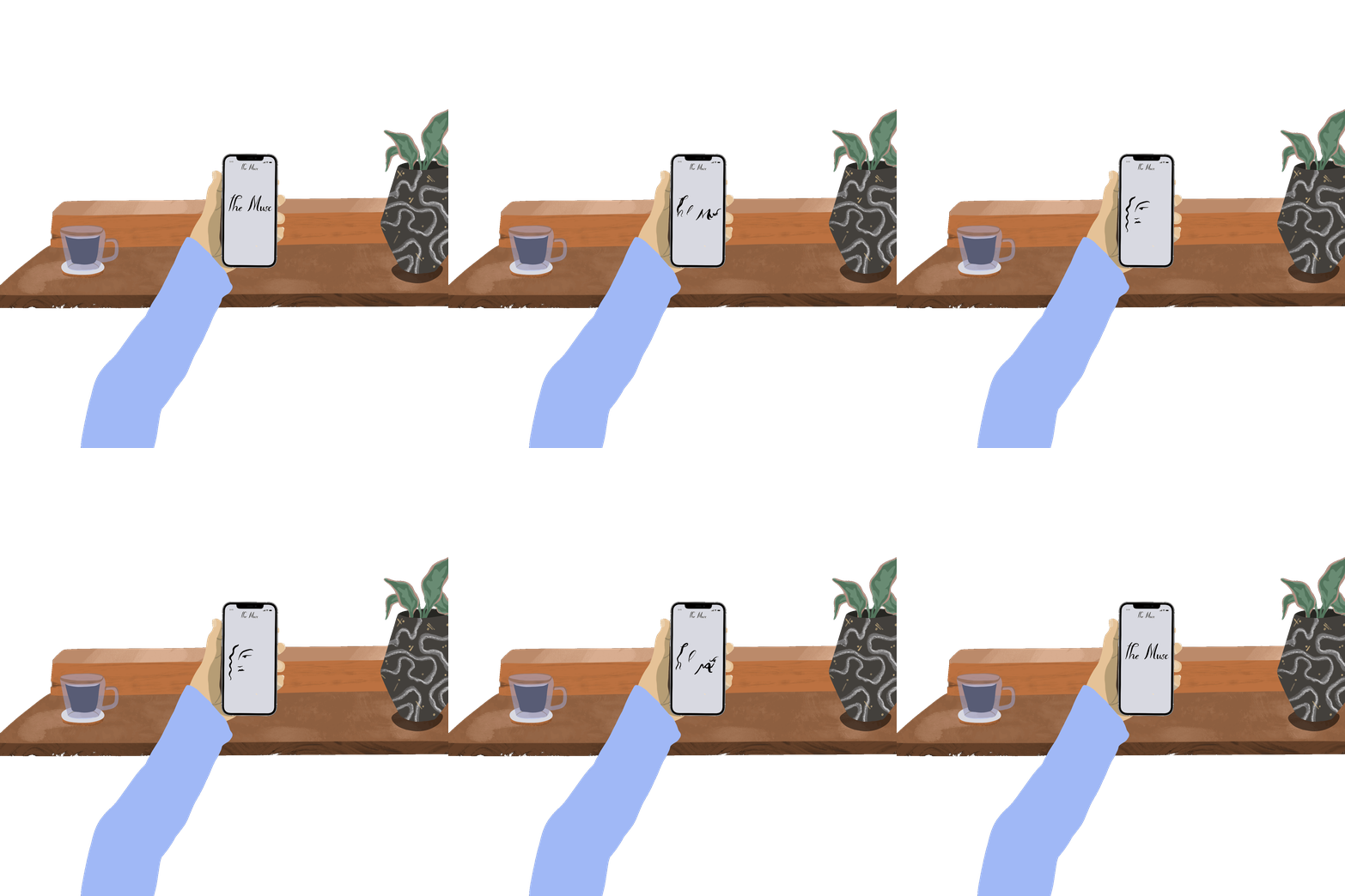
With “The Muse” in mind, I set out to create a fun and engaging landing page animation.
Sketches
We conducted a design studio session in order to start visualizing the screens we wanted to implement based on our initial research findings. We chose to focus on four key pages, posting, account, search, and profile. We focused on a mobile design per the client’s vision and the user research.
Wireframes
After consulting with our client to verify that our direction and his vision were still aligned, we proceeded to create some initial wireframes that we could use for our first round of usability testing. We agreed upon a number of features that we had defined in our research phase and illustrated in our design studio. These features represent the key flows that we wanted to test on our users.
testing the prototype
This round of testing was aimed at understanding how our potential users interact with this version of the application. We were interested in their ability to perform tasks that represent user flows and understand the navigational text. We tested six potential users. All users either identified as content creators or routinely spent time on a content-based application.
task SCENARIOS
You are a female musician who is interested in promoting her music. Could you show me how you would set up an account with ‘The Muse’?
You recently recorded a video of yourself performing. Could you show me how you would post that video to your account?
You’re interested in growing your fan base. Where would you look to review your subscriber and income-based metrics?
You want to be inspired by and support your fellow artists. How would you browse another content creator’s page?
Users were confused with some of our text, especially in the bottom navigation. “Engagement” and “Dashboard” were especially confusing. “Income” and “Subscriptions” caused the user to pause as well.
“‘Income’ - I think of how much money I make, I think payment is clearer.”
“‘Subscriptions’ - so this is what I pay to use the app?”
Users were excited about the possibility of setting goals, but had some questions about whether the goal was public and how they would track their progress.
Some of the 10pt font was tough to read.
Users ran into difficulty when prompted to browse another content creator’s page and review their metrics.
The flows I made and why
Onboarding
From the beginning, we knew that the on-boarding process would either be a draw or a deterrent to new users. Both content creators and consumers expressed that they were intimidated by long, text heavy on-boarding processes. To combat these pain points, I set out to make the onboarding process efficient, relevant, and visually-appealing.
Efficient - The step indicator at the top of the page gives the user a clear indication of where they are and how many steps are left in the process.
Relevant - I chose questions that would both give the user an idea of what this application would offer them as a platform for promoting their work and would help us populate future pages with small but important pieces of information.
Visually-Appealing - An engaging onboarding process is a lovely onboarding process. I created inclusive images that matched “The Muse” brand.
Posting and browsing content
Scheduling - Keeping to a posting schedule is critical for some content creators. Allowing them to schedule videos ahead of time helps them to better manage their engagement.
Searching - Consumers liked to be able to search by name or category while browsing content while content creators wanted to gain inspiration from their peers and support their fellow artists.
Subscribing - The subscription process is critical for both types of users. For the consumer, it provides a feeling of exclusivity and intimacy that they are searching for online. For the content creator, it allows them to make an income while doing what they love. I used this opportunity to show another content creator’s take on color customization and highlight the potential diversity of artists on the platform.
Bottom Navigation
Our users indicated through ease of use that the new labeling and consolidated navigation in the bottom bar was more intuitive. However, they still occasionally became lost and paused before moving forward. While some hesitation is understandable when interacting with a new application, I wanted to reinforce the bottom navigation by providing location indicators.
I implemented this design change in order to meet the standard of bottom navigation seen across popular applications, give users a visual indicator of their location, and provide some enjoyment through fun and unique interactions.
The MVP
Looking forward
Given the scope of this project, we chose to prioritize the experience of a content creator and deliver a concise user flow. Our next steps include:
Creating and supporting the consumer experience. This will involve a unique onboarding process and a reimagined dashboard page.
Implementing and testing a merchandise sale flow.
Further developing the gamification established in the awards section of the dashboard.
Introducing social media integration.
Thanks for visiting!
Please feel free to contact me to learn more about my work.

